
Redken - L’Oréal Groupe
When a brand like Redken comes to your door, you fling it open.
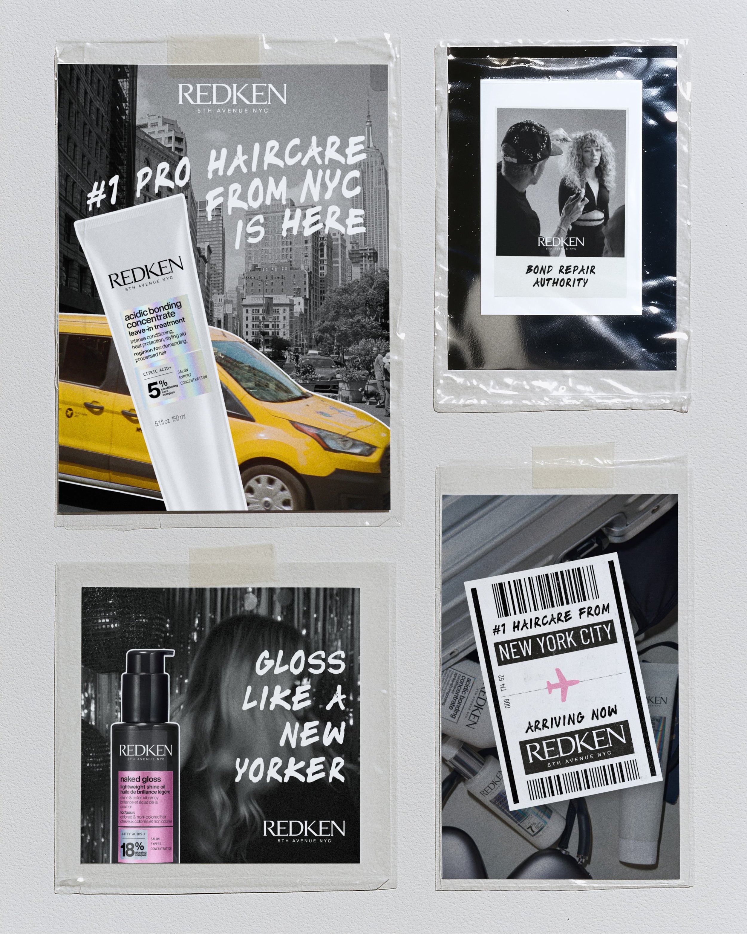
For the #1 pro haircare brand in the US, we designed a set of in-salon and point-of-sale graphics as part of its India salon expansion strategy.
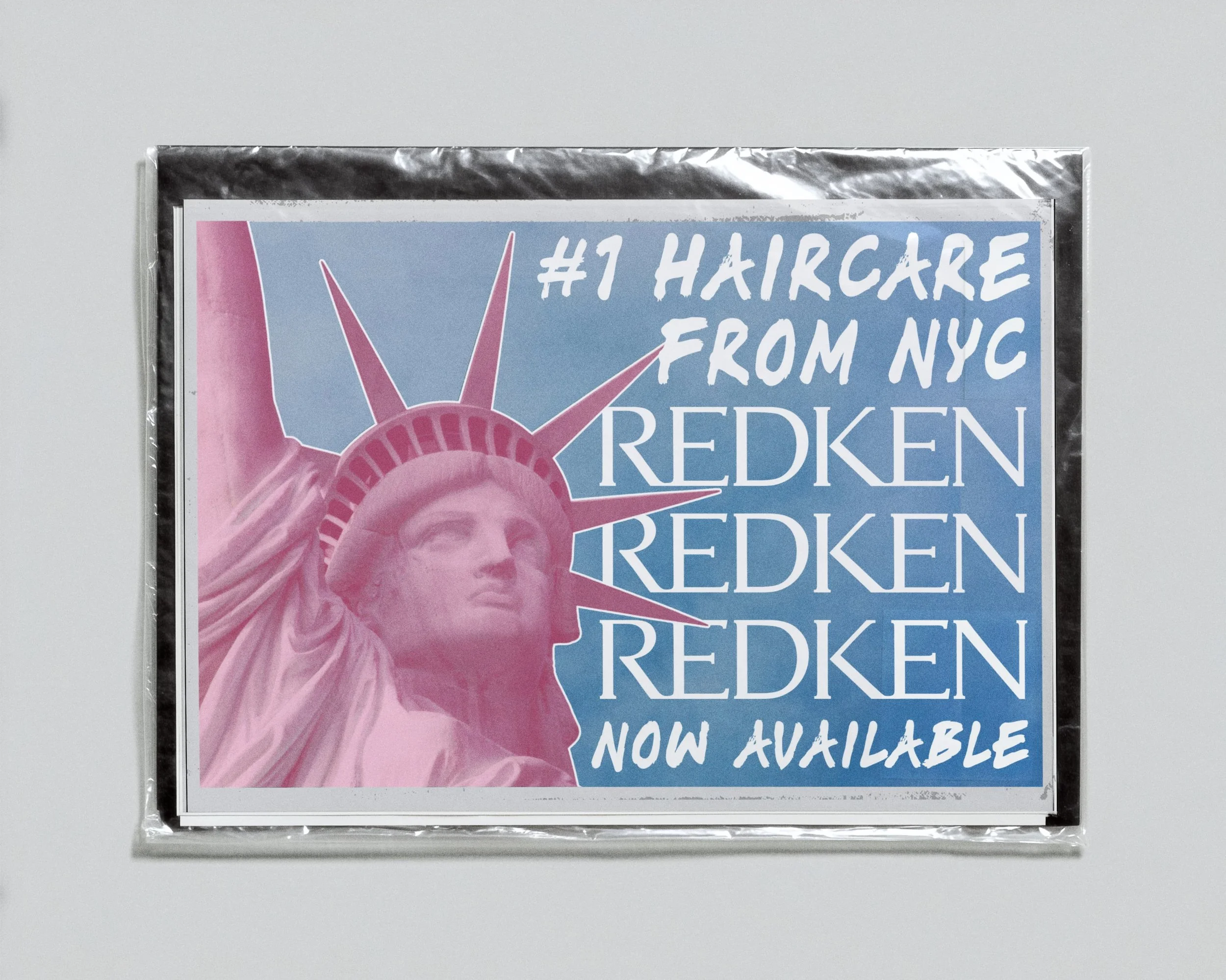
Drawing on the brand’s NYC roots, we played the city into the design, with each piece borrowing from New York souvenir language and travel moments. The taxi, the Statue of Liberty, the polaroid, the tag.
Built in Redken’s own type and palette, the set leans into the brand’s NYC energy. Urban, gritty and fashion-forward.
Most in-salon graphics follow the same formula of a product shot, a headline and a logo, and point-of-sale tends to become part of the furniture within a week. This brief asked us to break that formula and create something clients would still notice on their next visit.
So we based the entire approach around “visual speedbumps”, unexpected designs that catch the eye in a busy salon and give clients something to ask their stylist about.
[ SCOPE ]Concept Direction & Design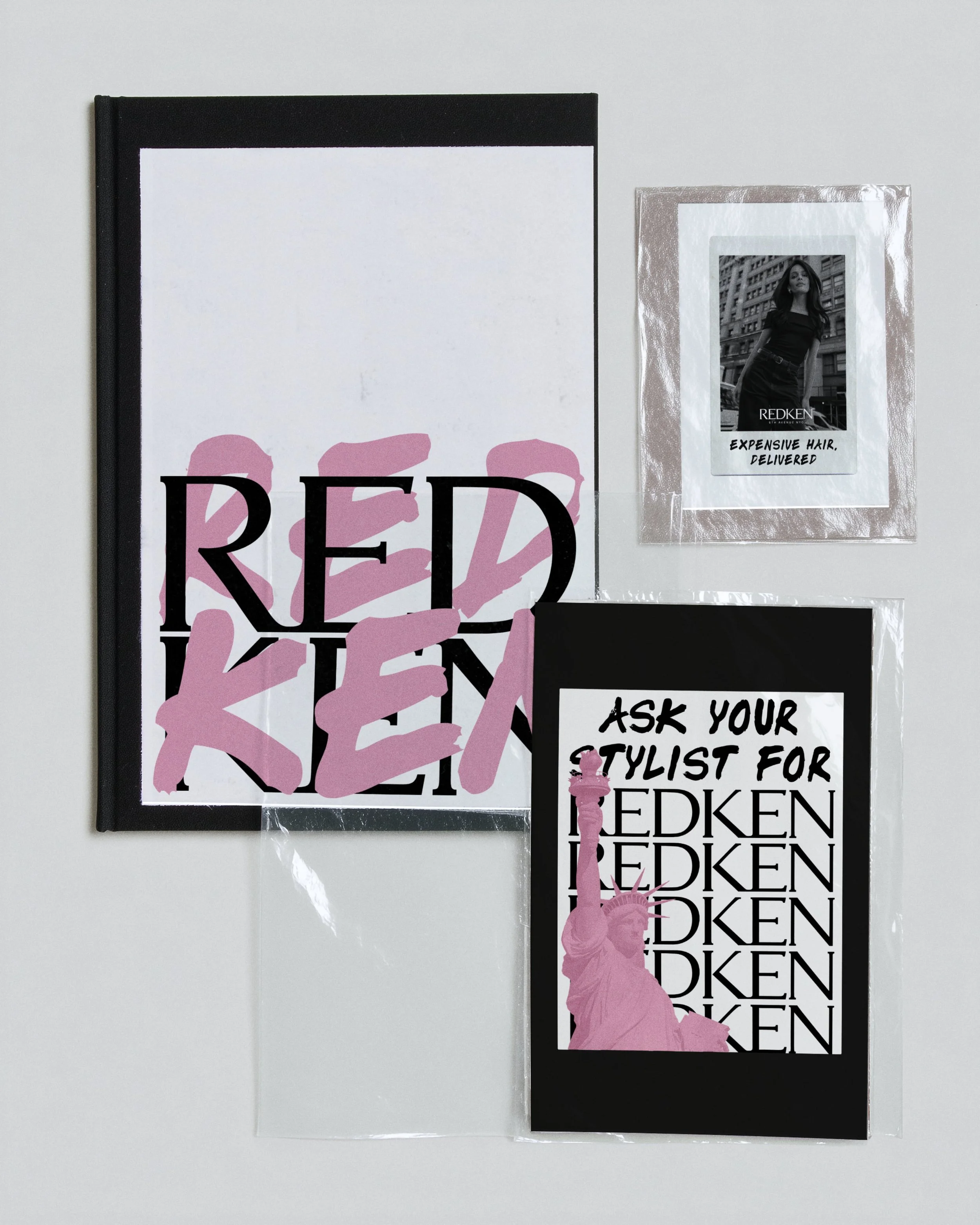
Nikita’s a great creative partner to work with. She’s incredibly easy to communicate with, asks all the right questions, and truly understands the brief! She turned the project around quickly and absolutely delivered. Everything felt young, elevated, and exactly the vibe that I was going for! Definitely coming back for more.
“
[ ANANYA, HEAD OF BRAND ]